
At Fritz Porter we love taking a look into the history of art and design, where it started and more importantly why. We are surrounded by colors, and with it being part of our everyday spaces and moods, we strive to find perfect harmony with the colors in our lives. But why do colors have such an affect on us?
It All Starts with 'Why'
Colors are perceived by us individually and communicate messages of emotions. Let’s look at the “why”. Why do some appeal and some do not, why are some better choices in our homes? Why are certain colors connected to specific emotions? Why do those colors reflect our emotions, and make us feel something? When discussing the why, we must look at the how.

While the principles of color theory date back farther than Leonardo da Vinci, we first want to take a look at the color wheel that resulted a few centuries later. Its roots date back to the mid 1600's when Sir Isaac Newton observed the way each color of light would bend as it passed through the prism. In his original Color Wheel he even included musical notes correlated with the colors beginning with red! We love this notion of specific colors set to music - how fascinating!
The Different Types of Color
The Color Wheel is made up of three different types of colors: primary, secondary, and tertiary. Primary colors: red, blue, yellow. Secondary colors: green, orange, purple. Tertiary colors (the six shades mixing primary and secondary): yellow-orange, red-orange, red-purple, blue-purple, blue-green, and yellow-green.

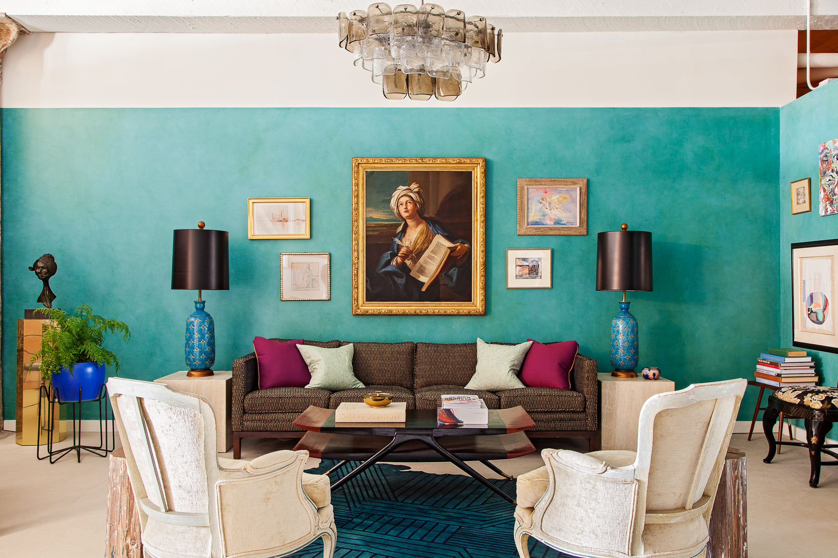
Finding Perfect Harmony in Color
Ever wonder why some rooms you enter underwhelm you while others scramble you so much and you can't even think? This would be attributed to finding "harmony". Harmony is something that is pleasing to our eyes or even in what we hear and feel. When there is not harmony we perceive it as either boring, and we are under-stimulated, or, it is so extreme and overdone that the over stimulation feels chaotic and we want to run from it. Harmony in color delivers not only visual interest but creates a sense or order. It is what will make our house a home. Look at the earth from the distance of a satellite and you view the colors created in perfect harmony.